Header
FreshFind
Discover local goods and authentic experiences in your neighborhood

Web
B2C
Redesign
Brief
Web Redesign • Apr - Sep 2021
I led the FreshFind Design Team, focusing on redesigning the eCommerce web platform and visual system to enhance the consumer shopping experience and improve efficiency.
I had the pleasure of collaborating with FreshFind's co-founders, James and Mike, and an exceptional design team to reimagine the shopping experience. Our goal was to create an engaging way for consumers to discover local businesses and products. We conducted a thorough evaluation of FreshFind's existing website, identifying areas for improvement using user-centered design methods.

Project Overview
Role
Built and coordinated a design team of 5. Led research and discovery. Redesigned the information architecture and UI of the website. Created prototypes.
Teams
UX Design, Business
Duration
6 Months
OS
Website
Tools
Figma, Adobe XD, FigJam
FreshFind is an eCommerce platform that bridges the gap between local consumers and businesses. By showcasing Farmers' Markets and Individual Producers, FreshFind cultivates a community that values product quality and responsible consumption.
While FreshFind primarily generates revenue through its Point-of-Sales system geared toward business owners, this project aims to broaden its sales pipeline by offering an intuitive online shopping experience for locally conscious consumers.
Problem
The unintuitive website design is hindering the online sales of local products.
Our research identified the following pain points:
-
The existing website lacks a clear structure, making it difficult for consumers to explore products offered by local businesses.
-
The overcrowded visual language of the website makes it challenging to communicate FreshFind's unique value proposition - the authentic touch with a real and diligent person behind every business.
Solution
We improved product discoverability on FreshFind's website by implementing a new organization scheme and a cleaner design visual system. Our deliverables included a sitemap, wireframes, mockups, and design system documentation for development hand-off.
UX Research
I conducted semi-structured interviews with 5 local business owners to understand their use of the existing FreshFind website and any pain points they encountered.
Additionally, formulating content strategies was a key aspect of our research phase. I led 2 content audit sessions with the co-founders to understand the purpose of specific sections and discover how we could optimize the content to drive business growth.
Our team identified an unorganized schema with duplicated pages that was impeding users' ability to easily discover products and services, consequently impacting sales performance.

Sitemapping
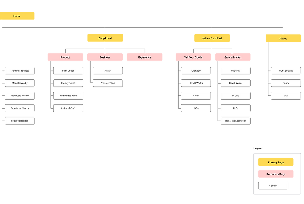
To enhance sales performance, we redesigned the website's core structure to create a more intuitive layout for customers to easily explore local products. This involved organizing the site around four primary pages: Home, Shop Local, Sell on FreshFind, and About.

Design Highlights
Home

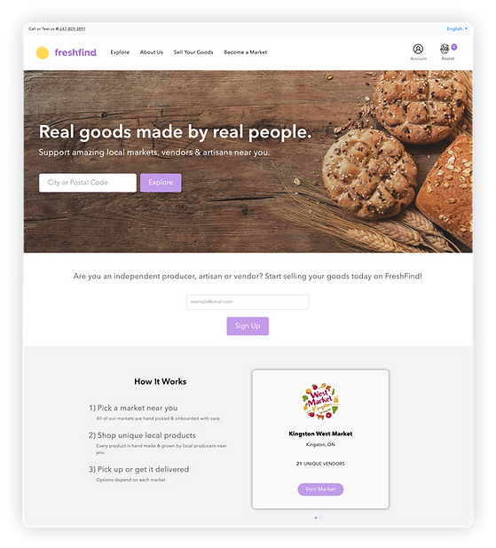
Before - Limited context about FreshFind's business nature as a marketplace meant that customers could only discover products on secondary pages after searching by postal code.

After - Customers can effortlessly discover local products, businesses, and experiences by browsing through highlighted cards. We prioritize showing relevant product and business images upfront, enhancing the browsing experience.
Shop Local


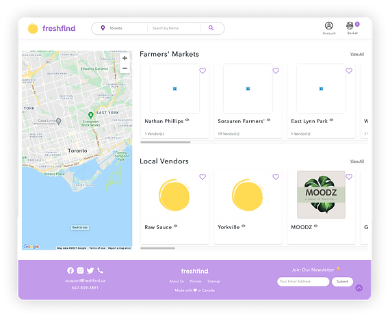
Before - Customers could initially browse only 3-4 options in each category (e.g., Farmers' Markets & Local Vendors) via a horizontal carousel. To view the complete list, they had to click "View All." There was no context provided for what each card represented.
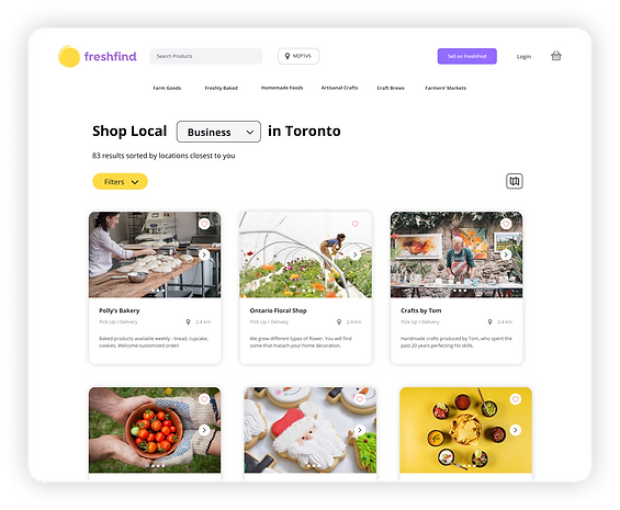
After - Customers can now explore more offerings through vertical scrolling in a grid view. Additional information, such as distance and logistics options, is displayed. An optional map view provides flexibility for customers with varying exploration preferences.
About


Before - A confusing secondary menu directed customers to new pages for each item, resulting in an unclear information hierarchy on the page.
After - We focused on clearly communicating FreshFind's value proposition. The information hierarchy of the page content was redefined, and relevant secondary sections were integrated into the page footer.
